Now Reading: Handwritten Fonts: When and How to Use Them Effectively?
-
01
Handwritten Fonts: When and How to Use Them Effectively?
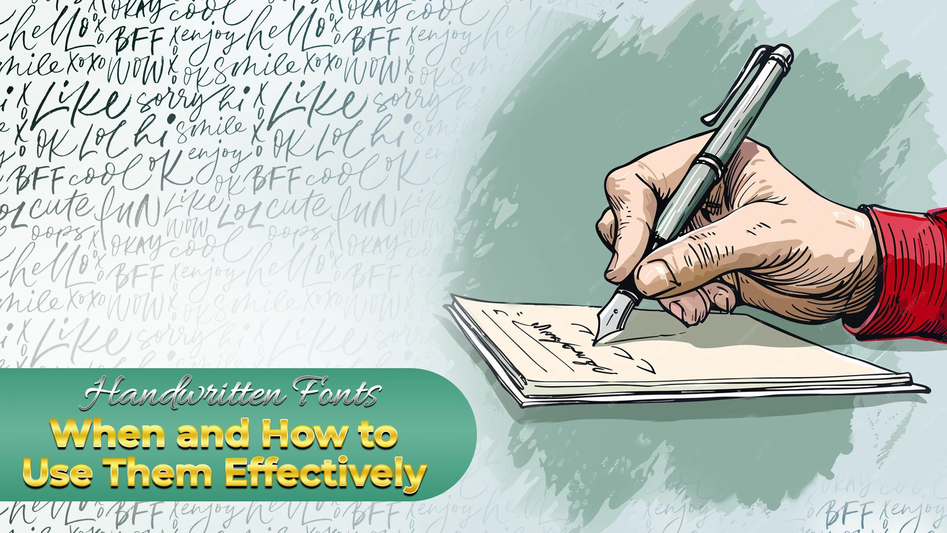
Today, as we can see, a lot of trendy and unique fonts have come into existence which influence how design and logos look. However, if we look closely, in some sections, the spark that handwritten fonts bring is still unmatchable. That is why bringing back handwritten fonts is also attracting the attention of the audience towards the brand that does it.
Handwritten fonts consist of a lot of detailed aspects and that is why matching them is not that simple, no matter how many varieties of fonts are developed and introduced. But, one thing that designers should not forget is the right use of handwritten fonts at the right time and right place. Let’s explore the right time to use handwritten fonts and also, some other details below.
Best Time to Use the Handwritten Fonts –
Handwritten fonts add a personal touch to the background and designs. That is why using them can make a brand and its design identical & very complex to match up with the others. However, there exist some particular times when handwritten fonts should be preferred over any other font styles.
Here are some best times when using handwritten fonts can give incredible results:
- To Convey Warmth and Personality –
Handwritten fonts can make your designs feel more friendly and approachable. For those brands who want to connect personally with their audience, these fonts will be the best action to be taken.
- For Call-to-Action Buttons –
Using handwritten fonts for your call-to-action buttons can make them more eye-catching. This way, you can increase the clicks for those buttons as well.
- To make Logos and Branding Impactful –
Handwritten fonts can be used to create a distinctive and memorable brand identity.
How to Use Handwritten Fonts Effectively?
To use handwritten fonts effectively, people need to follow the below points strictly:
- Use the handwritten fonts just sparingly and don’t overuse them.
- Don’t neglect the context and background of the design before using the font.
- Emphasize more on the readability of the text.
Frequently Asked Questions –
- What should be the best time to use handwritten fonts and why?
The use of handwritten fonts should be done sparingly so that it creates a difference and doesn’t lose its impact as well. For titles, branding, and accessibility, the use of handwritten fonts can be done.
Handwritten fonts are very simple and attract the attention of the audience really fast. That is why using them sparingly will immediately attract the audience and keep them engaged with the content for a longer time.
2. When not to use the handwritten fonts?
Just like the rules and regulations for the use of handwritten fonts are strictly followed, the rules for not using them or avoiding them should also be strictly followed. The times when handwritten fonts should be completely avoided are when a block message is to be written. This font is completely unsuitable for huge messages or paragraphs because it makes them boring to read.
3. How can handwritten fonts be made more readable?
To make the handwritten fonts more readable and easily understandable, make sure to choose the simplest forms of these fonts. Also, get well aware of the context and background of the design and then choose a contrasting yet resonating handwritten font to match the design.
Conclusion –
Every font has its own story to tell and understanding its story closely will help designers to use it rightly. With the help of handwritten fonts, a special and immediate impact can be received from the audience. This way, the brand recognition process can be accelerated and speedy results can be seen.
So, using handwritten fonts as a catalyst to accelerate the process of brand recognition and popularity will be the best decision that a designer can make for their or their client’s designs. Undoubtedly, handwritten fonts are the rock stones for the marketing profession in the year 2025.


Related Posts


Stay Informed With the Latest & Most Important News
Previous Post
Next Post


Advertisement

-
 01Top 10 Trending Fonts of 2025
 -
 02Font Personalities: What Your Favorite Typeface Says About You?
 -
 03The Role of Fonts in Memes: Typography’s Impact on Internet Humor
 -
 04Fonts and Nostalgia: How Vintage Typography is Making a Comeback?
 -
 05Cultural Influence in Fonts: How Different Regions Shape Typography?
 -
 06Fonts in Gaming: How Typography Shapes Player Experiences?
 -
 07The Science Behind Readable Fonts: Insights from UX Design