Now Reading: The Most Controversial Fonts in Design History
-
01
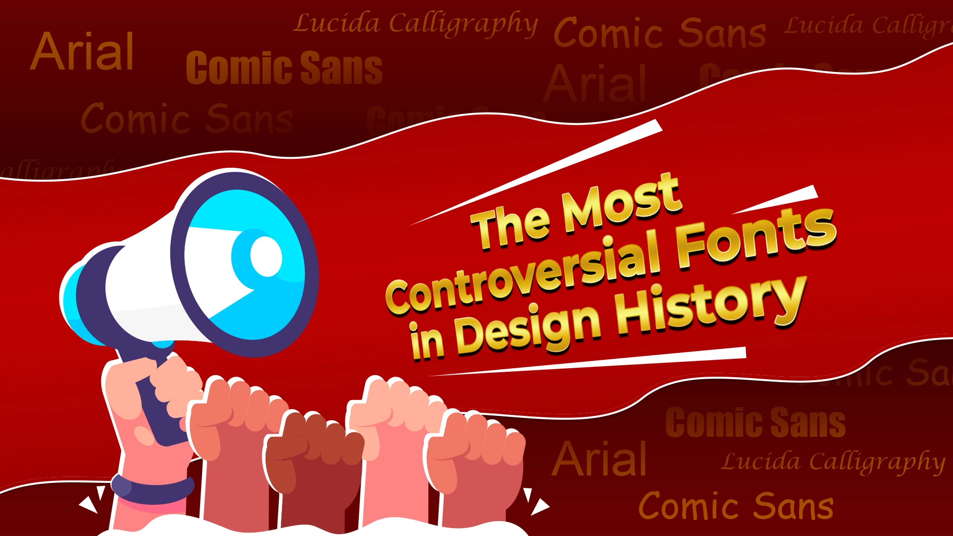
The Most Controversial Fonts in Design History
Controversy is a mere word but undoubtedly has the power to destroy anything that comes in its way. Whether it be a human or any element, controversies can destroy their whole careers, even before they are formed.
You may not believe it or laugh it out, but even fonts have faced many controversies in the design industry in the past. In this blog, let’s explore the reasons for these controversies and the font styles that got trapped in this vicious cycle in detail.
Why are the Fonts Controversial in Design History?
Research and observation have shown for several years now that controversies are 90% due to misconceptions and miscommunications. Also, many times misunderstanding of a person starts a controversy and it keeps spreading like wildfire, even before another person stops and takes time to think about it. Mostly, we have heard about controversies in the lives of film stars and idols. However, even things that don’t live in the limelight all the time can also face controversies and speculations from humans.
The widespreadness of a particular font style creates a lot of debates and this may ultimately spread many controversies about its use and specifications as well. Some common reasons why controversies of fonts have taken place in the design history are:
- The thought process of the designer behind using the font didn’t match with the reader.
- Receivers faced major problems regarding the accessibility of the fonts.
- Proper awareness about the use of fonts in particular designs was missing.
- Many copyright and licensing issues occurred and designers faced legal complications for using these fonts.
Topmost Controversial Fonts in Design History –
Following are some topmost controversial fonts that existed in design history and faced the wrath of people:
- Arial –
Arial was criticized in the past for being mostly similar to Helvetica font style. Also, this font style became a symbol of baldness and lack of creativity in the past.
- Comic Sans –
Comic Sans was very famous font style for comic books but got into controversies due to being labeled as childish and having inappropriate contexts.
- Impact –
Impact was often criticized and got trapped into controversies due to being overused on the internet. It became a cliche font style that everyone started avoiding to use for fear of not going viral or becoming popular.
- Lucida Calligraphy –
This font is said to mimic human handwriting ad not deliver the grace that calligraphy writing should. The natural flow and touch of calligraphy were said to be missing in this font style.
Frequently Asked Questions –
- List down 4 important and topmost controversial fonts in design history.
The 4 most important and topmost controversial fonts in design history are: Lucida Calligraphy, Arial, Impact, and Comic Sans. Apart from these 4, there also exist many other fonts that may not rank topmost in the list but are equally controversial because of the emotions that they express, the message that they deliver, and their growing popularity and acceptance. These fonts can be listed as: Papyrus, Hobo, Curlz MT, Bradley Hand ITC, etc.
2. What were the reasons why the fonts faced controversies in design history?
Fonts faced controversies in design history for a lot of reasons. Some of them were: e fonts by various design brands, repetitive use of the same font, difficulties in the accessibility of the fonts, copyright and licensing issues occurring due to unawareness of legal procedures, and so on. The occurrence of these errors, people started spreading controversies about the particular fonts and this caused the great collapse of these fonts at that time as well.
3. What should be learned as a lesson from the font controversies that occurred in the past?
There can be a lot of things that can be learned as a lesson from the font controversies that occurred in the past. Some of these lessons can be: being alert and mindful about accessibility, choosing fonts that relate to the context exactly, getting deeper into the legalities, and ensuring complete legal transperancy, etc.
One thing that people should not forget while choosing the fonts is that today’s world is a much more progressive one and diversity is today’s best policy. That is why selecting multiple fonts and putting your best creativity to work to bring the best from them is what would customize your designs and make them unique from others.
Conclusion –
Considering the controversies that are created regarding the above-mentioned font styles, it would be best to analyze the whole situation, research them and other fonts in detail, and then use them wisely. Any vague choice would be bad for your brand or client because that may bring a lot of other controversies along with it.
Therefore, even if someone had said that “any publicity is a bad publicity”, it would definitely not be good for your brand to bring controversies and cause trouble in any context at all. So, be wise, research properly, shortlist the fonts, and then use them according to their respective emotions and purpose to get the best results for your brand for sure.


Related Posts

Stay Informed With the Latest & Most Important News
Previous Post
Next Post


Advertisement

-
 01Top 10 Trending Fonts of 2025
 -
 02Font Personalities: What Your Favorite Typeface Says About You?
 -
 03The Role of Fonts in Memes: Typography’s Impact on Internet Humor
 -
 04Fonts and Nostalgia: How Vintage Typography is Making a Comeback?
 -
 05Cultural Influence in Fonts: How Different Regions Shape Typography?
 -
 06Fonts in Gaming: How Typography Shapes Player Experiences?
 -
 07The Science Behind Readable Fonts: Insights from UX Design