Now Reading: Top 10 Trending Fonts of 2025
-
01
Top 10 Trending Fonts of 2025
Top 10 Trending Fonts of 2025

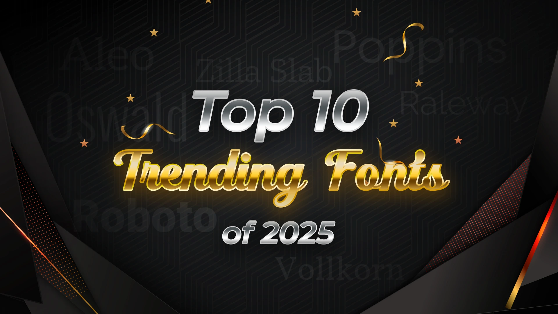
According to the research, it is concluded that the year 2025 will be dedicated to the retro and classy fonts of the 70s and 80s.This wave already started and achieved a great pace in the ending months of 2024 and is said to strongly influence even the year 2025.
However, before going into the details of which font styles will trend in the year 2025, the most important question should be addressed first. While discussing different font styles, we should not forget the sole purpose of developing them in the first place.
Using different font styles is a very important marketing strategy nowadays and is also a prominent aspect of graphic design. Even the graphic design and UI/UX field consists of typography, which includes using the right type of font to deliver the right message.
Why is it Necessary to Use Different Font Styles?
Imagine you are reading a book in which every word is the same size, color, and style. How would you feel while reading such a book? Wouldn’t it be boring to read a book that not only doesn’t have a single picture but also has a very bland font style?
On the book’s cover, the preface, the index, and even the title of the chapters are all in the same font style (not even bold, underlined, or highlighted in any possible way). Normal people don’t have the capacity (or superpower to be accurate) to read such a book for more than 2-3 pages.
Do you know why is it so? Even if the content of the book can be superb and eye-opening, still people would not be able to read that book for long. This is because different human beings need creativity in whatever they do and subtlety bores them after a particular period.
That is why different font styles and innovative font designs are crucial. They bring creativity and impact to your text or message in their own way. These varied font styles help people know which part to emphasize and which is the most important for them. For the same reason, whichever text human brains can develop and human eyes can see undoubtedly has a mixture of font styles in it.
Importance of Using Appropriate Fonts in Your Text –
Even though being underrated, font holds immense power in delivering the right message and with the right impact.
Following are some important reasons why using appropriate fonts in your text can prove helpful:
- Clarity in Reading and Comprehending the Message –
Using the right type of font is very important when it comes to communicating the right message. It is very important for the sender to communicate the right message to the recipient so that they can achieve what they want through it. That is why using the right type of font is also considered an important marketing technique.
- Shows Utmost Professionalism and Increases Brand Worth –
In today’s world where technology is at a higher pace, professionalism can only be seen in the fonts and the structuring of sentences in emails and on social media.
That is why using the right font has become crucial to show professionalism, not only to the company’s clients but to the audience as well. Ultimately this impacts the attention that the company receives from the audience and this sums up increasing the brand worth to a great extent.
- Look Good and Attractive to the Eyes –
Fonts that are beautifully written always attract the attention of people. That is why even if the common words are written on paper, calligraphy has gained much more importance than even writing and highlighting with colored pens. Just like the offline form of attracting people’s attention to words was calligraphy, the online version has different font styles.
- Helps in Attracting the Reader’s Attention to Details –
Today, the attention span of people has reduced to about 10-15 seconds. That is why the first thing that people notice in your text is not the content but the looks. Just like a person’s personality is their strongest armor, in the same way, appropriate font style is a message or text’s best armor.
If your words are being shielded with the most effective and suitable font style, then those words are definitely to reach thousands of people, attract the attention of a huge audience, and touch millions of hearts.
- Shows the Creativity and Uniqueness of Thoughts –
Everyone has a different thinking process and aligning your thoughts with others is very difficult for individuals. That is why fonts play a crucial role in not only understanding the thought process of the audience but also conveying that of the writer. Also, showcasing one’s creativity and uniqueness is best possible by using the most appropriate font style.
- Gives Very Aesthetic Vibes and is Visually Appealing –
Using visually appealing and aesthetic font style impresses today’s generation the most and makes them realize things that even their closest ones won’t be able to explain to them. This can be about serious environmental issues, mental issues being real, dangerous but underrated and often ignored health conditions, or any other topics.
For giving cool and aesthetic vibes to today’s generation and making the text visually appealing, using different font styles is a very crucial and unignorable element.
- Helps Readers in Feeling the Emotions of the Writer –
Many may not truly believe it but fonts are a form of expression of the emotions that a writer wants to express. Expressing emotions may not work more impactfully in professional life but on a personal scale, fonts act remarkably in making the writer’s words touch the heart of the reader or catch their eyes.
Expressing emotions, whether they are happy, sad, sorrow, grief, anger, gratitude, pleasure, satisfaction, curiosity, hope, or even regret, is best possible if the right message is given using the right font style.
- Makes the Message Easy-to-Read and Accessible –
Not everyone is eligible to understand the emotions of others and that is why being able to convey them rightly is crucial. This can be made possible with the help of different font styles. Using different font styles will help people to differentiate between the text that is crucial and should be read urgently and the one that can wait.
Using highlighted font for the title and also the crucial parts of the message can help people identify these parts even from a 3000-word message. This will not only rely on the writer’s message properly to the reader but will also save a lot of their time.
- Breaks the Barriers of Stereotypes –
Today’s generation needs constant changes and innovation in their day-to-day life. This aligns with the font in their text as well. Those who use stereotypical fonts don’t usually stand out and attract the attention of those who constantly want something innovative and out-of-the-box.
So, by understanding and using trending and varied fonts, reaching a huge audience and impressing them becomes possible and in fact, much easier.
Using trending and varied fonts is not only helpful in marketing but can also leave a special impact on your personality on others. Adopting trending fonts and using them for your messages, posts, etc., can help you be creative, even without paying too much attention to them.
What is Font Pairing? How to Facilitate Harmonious Font Pairing?
Combining different fonts harmoniously is also an art of 2025. Bringing together different fonts to make a perfect blend is proving amazing for people nowadays. Font pairing is a unique art that needs detailed knowledge about every font style and its use in emphasizing the text and giving out the best possible message.
There exist some key principles that should be considered during font pairing and which make the process harmonious and satisfactory. These key principles are:
- Combining Contrasts –
Combining different font styles together can give purpose and great impression to your message and help you convey it rightly. A formal font can be combined with sans serif font styles to give a realistic and strong impression of the message or text.
The delivery of these combined font styles leaves a strong impression on people and this makes attracting a great audience and also keeps them engaged for a longer time.
- Mixing Historical Aesthetics –
Mixing 2 historical aesthetic fonts together will be incredible for those who want to reveal important information or send a strong message to the audience.
- Choose Readability of the Font –
Select 2 readable and clearer font styles together and make the text easier and more convenient to understand. Such combinations can be effective for the delivery of appropriate messages even throughout long messages.
- Don’t Go Too Far –
Combining 2 contrasting, historic backgrounded, or extremely readable font styles will surely leave a good impression on a huge number of audience. But, understanding the purpose of all the font styles properly and then combining the ones that would go perfectly with each other is very crucial.
For example, going extra and combining 3 or more fonts in a single message is surely not advisable. This is because, instead of looking good and strong, this will create a mess and distract the audience from the actual message that needs to be revealed by the writer. So, be thoughtful while using font pairing so that harmonious results can be received.
If font pairing is done properly considering the above principles, then getting impeccable results is undoubted. That is why people should properly go through these principles and then decide which fonts to combine and bring together.
Top 10 Trending Fonts that Can be Actively Used in 2025 –
Right from the innovation of different font styles, people have been experimenting and bringing the best font styles for others to use from time to time. However, the 21st century is mostly about reminiscing the past and combining it with the present for a great impact. That is why 2025 will be a year of reminiscing the font styles and designs of 70s and 80s & giving them some modern touch.
Below is a list of the top 10 trending font styles that will rock in 2025 and will convince people of different fields to use them for different purposes:
- Aleo –
This is a contemporary type of font style that was designed by Alessio Laiso. It was designed to support and be a companion for the Lato font (which was ultimately designed by Lukasz Dziedzic.
The font style is very thin and the characters appear in rounded form. Due to the rounded shape of this font, the readability of this font increases greatly and the personality of the writer appears to be strong & confident.
- Mattone –
The strokes and ends of this font style are sharp even if the internal parts are curved and wide. This font has high visibility because of its curved structure and blunt ending. Undoubtedly, this font can be best used for underlined headings and in graphic designing for typography.
Those who develop printed or digital designs can use this font to make the graphics noticed by the audience.
- Poppins –
The shape of this font is somewhat geometric and that is why it is called geometric sans serif typeface. This font style supports and is adopted from Devanagari and Latin styles of writing. In fact, this font is the first type of Devanagari that was ever invented.
Using this font is best for signage, digital projects, headings, logos, and even branding. The character set of this font is very extensive and that is why it provides multilingual support to those who use it for graphics, marketing, and other purposes.
- ES Rebond Grotesque (Medium) –
Another amazing font style preferred for headings of articles or even a message is ES Rebond Grotesque (Medium). The main attribute of this font style is that it is already bold and displays a sans-serif style. Its contemporary design makes a strong and bold impression on the readers, while its texture is flexible to suit any type of message, whether social or personal.
The design of the font style is influenced by French-Swiss writing and also includes some special attributes of the Germanic Grotesque font style. Speaking about the tone of the font style is quite subtle and neutral.
- Roboto –
Along with the geometric form and texture, the Roboto font style consists of a mechanical core and skeleton as well. That is why it was a very popular font style in the 70s and 80s. With some specific aspects recreated and remade, this font style is all set to gain its power and impression back even in 2025.
The curves of the font only showcase friendliness and messages with compassion can be passed on with full impression through this font style. For quick and regular screen readers, this font style will surely be easier to read and understand & will also leave a great impression on people for a longer time. The width of this font is very natural and does not contain any extra additions or extended lengths. This helps people read the font naturally and without trying too hard to understand the words & their meaning.
- Raleway –
To give your text a modern and improvised touch, using the Raleway font style will be perfect. Graphic designs, banners, and social media posts made using this font style will attract people’s attention right away and will be a great start for businesses to gain pace in the market.
Raleway font style consists of a very thin and sleek texture when it comes to lines, open counters, and strokes. It is primarily inspired by the neo-grotesque sans serif style. The special aesthetic look of this font style makes it perfect for headlines and short sentences & paragraphs.
- Zilla Slab –
This is a purely italic font style that gives a very humanist touch or influence. The bracketing included in this font is almost negligible and approaches people in a very friendly method. One of the most important aspects of this font is that it can only be used in Italics or regular form and cannot have the impact of bold or underline.
That is why this font style is best for the content written below a particular heading and not the title itself.
The inspiration for this font style was originally taken from the Typotheque’s Tesla style. Its pairing can be done with sans serifs to leave a special impression of the writer’s thoughts on the readers.
- Vollkorn –
This is one of the best font styles for regular use and indicates a very normal and quiet, yet high-quality tone. First time, this font style was designed by Friedrich Althausen and once it was officially published through a Creative Commons license, it gained thousands of downloads in very little time.
Due to its availability for regular use, this font style can be accessible in multiple patterns such as medium italic, bold italic, regular, black, semi-bold, etc.
The meaning of Vollkorn in German is ‘wholemeal’ and it basically means small font styles that are regular and also common in most text and messages. Mostly, people around the world are well-acquainted with this font style and use it randomly and free-hand. That is why this font style is undoubtedly available on Typewolf, Google Fonts, and even Adobe Fonts.
- Oswald –
Oswald’s font style is adopted from the Alternate Gothic sans serif typefaces and leaves a historically unique impression on people. The original Alternate Gothic font style is reworked and reframed to be made better and is very effective in today’s times. That is why it is expected to gain a lot of popularity and importance in the year 2025, just like it did in the year 2024.
Oswald font style is available on Google Fonts very actively so that people from graphic designing, typography, or other fields can use it freely. For headlines, logo texts, or even web design texts, this font style is best suited and can be proved very effective in 2025.
- Playfair Display –
Playfair Display font style was specially designed by Claus Eggers Sorensen (a Danish designer) in the year 2011. This font style is a combination of highly contrasting thin and thick strokes. Normally, it has 6 weights and can be used only in regular and italic font styles.
Even the capitals in this font look really small and restricted. That is why this font is mostly preferred in writing text or messages of 1 or 2 lines and not more than that.
The above-mentioned fonts will list remarkably in the year 2025 because of their special attributes reflecting the past font styles beautifully, Some of these font styles are retro and will bring the impact of those times in today’s modern world. Undoubtedly, this will prove to be a new and unique social media marketing concept for many companies and industries.
Frequently Asked Questions –
- What are some common patterns of font styles that will trend in 2025?
Even though the retro font pattern has been trending since 2024 and will continue to do so in 2025, there still exist some other patterns that are prominent in today’s times.
These patterns are display fonts, quirky san serifs, vintage-inspired fonts, and handwritten scripts. These provide an additional and personal touch to the fonts and make them much more aesthetic and modern-like.
- Can people get free font styles for use professionally?
Some websites or platforms offer free font styles for professional use, however, getting premium subscriptions on platforms or websites can help people much more font style options as compared to the free ones, for a better professional experience.
Conclusion –
Using different font styles is today’s way of marketing products uniquely and bringing people’s attention to one’s product and ultimately business. However, mixing up 2 or more fonts is also a trend that is spreading immensely nowadays.
This is because multiple fonts can catch the eyes of people at once and convince them to read the whole content. Even if this process doesn’t bring immediate sales, it at least increases the traffic on the website or the format where the content is uploaded.
Therefore, understanding the trending font styles of 2025 and trying to adopt as many of them as possible in your day-to-day work will enhance the quality of your work. Also, this will reduce the time and effort that are required to bring something out of the box to the table and leave a good impression on the market.
Stay Informed With the Latest & Most Important News
Previous Post
Next Post
-
 01Top 10 Trending Fonts of 2025
 -
 02Font Personalities: What Your Favorite Typeface Says About You?
 -
 03The Role of Fonts in Memes: Typography’s Impact on Internet Humor
 -
 04Fonts and Nostalgia: How Vintage Typography is Making a Comeback?
 -
 05Cultural Influence in Fonts: How Different Regions Shape Typography?
 -
 06Fonts in Gaming: How Typography Shapes Player Experiences?
 -
 07The Science Behind Readable Fonts: Insights from UX Design


