Now Reading: Typography Mistakes to Avoid in Professional Designs
-
01
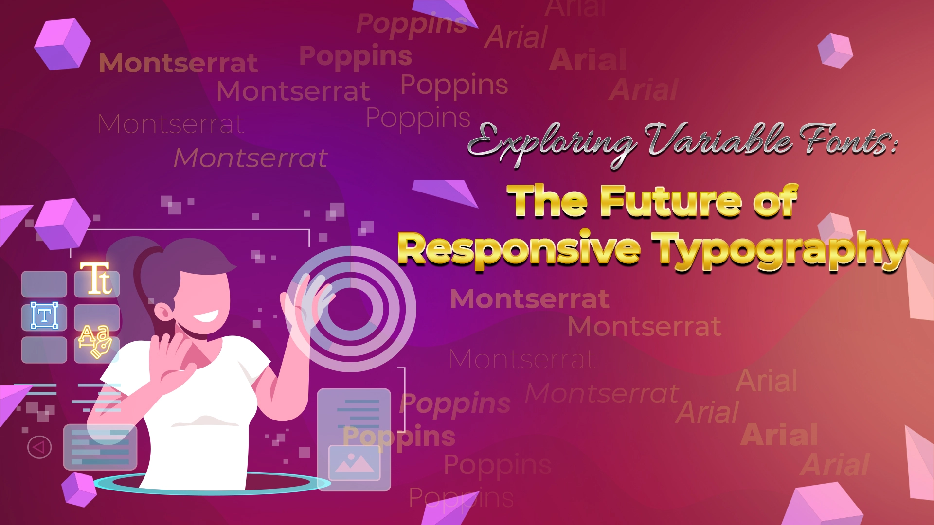
Typography Mistakes to Avoid in Professional Designs

Typography is one of the most recognized ways of communication for artists and designers today. This is because typography can break the barriers of silent designs, combine with stylish backgrounds and designs, & make the message heard by the audience. However, many mistakes can also occur in this process, as it is very rightly said that nothing and no one in this world is 100% perfect.
However, what designers usually don’t do is recognize their mistakes, take a lesson from them, correct them as much as possible, and not repeat them ever again. This is what brings about innovation and great recognition to people’s designs and ultimately their brands.
Common Typography Mistakes to Avoid in Professional Designs –
Even if we hear about the most common typography mistakes that are done, many professionals tend to repeat them unintentionally and this costs them a lot of wasted time effort, and sometimes money as well.
So, below is a list of some of the most common typography mistakes to avoid in professional designs to bring up to the mark results for them:
- Taking Pair Fonts Too Seriously and Using Multiple Fonts –
Pair fonts should only be used where creativity is to be showcased and not randomly for all designs. This is because using too many font styles will cause a bad mixture of the fonts and distract the audience from the actual cause and message of the brand.
- Setting an Aggressive Tone with Repetitive Use of All Caps –
Another crucial mistake that is commonly designers make is setting improper and very aggressive tones. This tone can be set due to the repetitive use of capital letters. Using All Caps is the worst decision because it will highlight the text too much and keep the whole background covered up.
For genuine and heartwarming messages, setting such an aggressive and abrupt tone will not at all be beneficial and instead cause too much trouble for the brand for sure.
- Disturbed Line Spacing throughout the Content –
While working on your designs with font styles, don’t forget to keep the line spacing symmetrical and properly aligned. Aligning the fonts is very important and wise to get the best out of your designs.
- Kerning Errors are Usually Neglected but Turn Serious –
Kerning refers to the space between 2 characters of a single word. Unusual spacing between the 2 characters of a word can cause a disturbance in the reader’s attention and may divert them from the actual content.
Also, this can be responsible for the readers to lose their interest in reading the book or novel further. That is why such a crucial mistake should be strictly avoided, even if the printing of a book is computerized.
When the above mistakes take place in typography, the results that people get are not pretty convincing. That is why these common typographical mistakes should be strictly avoided if you don’t want to disturb the flow of your novel or book to any extent at all.
Frequently Asked Questions –
- Why do people make mistakes while using typography in professional designs?
As we all know it is very common for humans to make mistakes in almost all the things that they do. However, for some mistakes, people may have to pay a lot and suffer from huge losses personally and professionally. The same goes for typography mistakes made by professionals which if not detected & corrected at the right time cause them huge troubles and losses.
Mostly, in the rush and anxiety of creating something unique and complex, simple things are ignored and this is where professionals cause minor yet common typography mistakes.
2. How can people learn in detail about Typography and its mistakes in detail and not repeat them?
To not repeat the common mistakes that people using Typography usually make, you need to understand the concept and its mistakes in brief detail. Learning more about them can be through online learning sources such as Udemy, Coursera, and Skillshare, and also from websites such as I Love Typography, Fonts.com, etc.
3. Is it so important to understand about Typography and use them in your designs?
One of the most important yet basic reasons why Typography should be understood and used as a top priority is to enhance your designs and bring the best out of them. Bringing out-of-the-box and unique designs for brands and clients is the purpose of collaborating typography with your designs.
Conclusion –
Making the best out of your designs and enhancing them to the next level is the job of typography effects and different font styles. However, when frequent mistakes in the use of appropriate fonts are made, then the results are not as expected as they are required to be.
That is why understanding what common mistakes others make and avoiding them beforehand is crucial. This way, people will be able to make a proper and amazing mashup of their font styles and designs & make something incredible out of it undoubtedly.


Related Posts


Stay Informed With the Latest & Most Important News
Previous Post
Next Post


Advertisement

-
 01Top 10 Trending Fonts of 2025
 -
 02Font Personalities: What Your Favorite Typeface Says About You?
 -
 03The Role of Fonts in Memes: Typography’s Impact on Internet Humor
 -
 04Fonts and Nostalgia: How Vintage Typography is Making a Comeback?
 -
 05Cultural Influence in Fonts: How Different Regions Shape Typography?
 -
 06Fonts in Gaming: How Typography Shapes Player Experiences?
 -
 07The Science Behind Readable Fonts: Insights from UX Design